

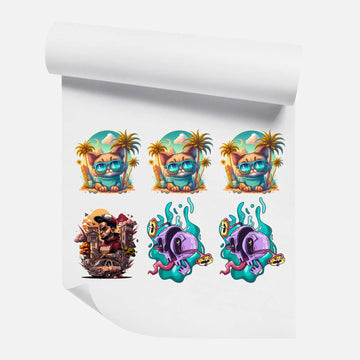
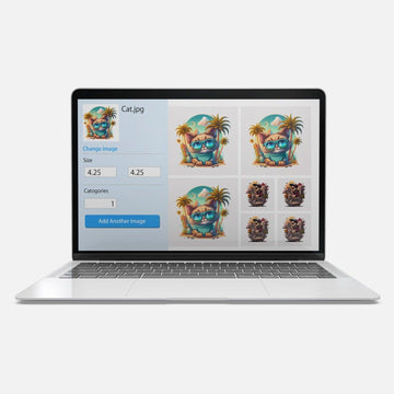
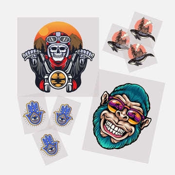






Black and dark shirts are consistently the most popular blank garment colors in custom apparel. They also used to be the hardest to print on well — until DTF transfers changed the equation. When you order DTF transfers by size and quantity, every transfer already includes a white ink underbase that makes full-color printing on any dark fabric clean, accurate, and vibrant. No extra steps, no special order, no upcharge for dark garments.
That said, there are real differences between printing on a white shirt and printing on a black one — differences in how you design, what colors behave like on dark fabric, and how to get the most out of the DTF process on dark garments. This guide covers all of it, from how the white underbase works to design tips, press settings, and the most common mistakes decorators make when printing on dark shirts for the first time.
Why Dark Shirts Are Different to Print On
When you press a DTF transfer onto a white shirt, the fabric itself serves as a natural background for the ink. Colors sit directly on the white surface and appear exactly as they do in your design file — bright, accurate, and clean.
On a black or dark shirt, the fabric absorbs light rather than reflecting it. Color inks are semi-transparent by nature. Without something opaque beneath them, those colors disappear into the dark fabric — reds become muddy, yellows vanish, blues darken beyond recognition.
This is the fundamental challenge every printing method faces on dark garments. Screen printing solves it with a white flash layer. Sublimation cannot solve it at all — it is chemically incompatible with dark polyester and produces faded, washed-out results. DTF solves it automatically with a white ink underbase built into every transfer. See our FAQ about ordering for more on how the DTF process handles different fabric colors.
How the White Ink Underbase Works in DTF
When a DTF transfer is produced, the RIP software that drives the printer automatically generates a white ink layer beneath your design. This layer prints first onto the film, creating an opaque white foundation. The CMYK color inks then print on top of that white base.
The result is a complete, self-contained transfer that carries both the white base and the color layers together. When you press it onto a black shirt, the white layer bonds to the fabric first, creating a bright, opaque surface for the color inks to show against. The colors you see in your design file are the colors that appear on the finished shirt — accurate, saturated, and visible.
This happens automatically on every DTF transfer. You do not need to add a white layer to your design file, request it separately, or pay extra for it. It is built into the production process.
What Changes When You Design for Dark Shirts
Even though the white underbase handles the technical challenge automatically, your design choices still affect how a print looks on dark fabric. A few key considerations:
High Contrast Designs Work Best
Dark fabric is a dramatic backdrop. Designs with strong contrast — bright colors against the black, bold white elements, vivid saturated graphics — look striking on dark shirts. The contrast between the printed design and the dark garment creates a visual impact that the same design on a white shirt simply cannot replicate.
Low-contrast designs — pale colors, subtle gradients between similar tones, fine details in muted shades — can get lost against dark fabric or appear less defined than they would on a light background. If your design has a delicate, understated look, test it on a dark shirt before committing to a large order.
White Elements in Your Design
On a white shirt, white elements in your design are invisible — they just show as the shirt itself. On a dark shirt, white elements print as opaque white ink from the underbase and become the most visible part of the design. If your artwork has white text or white outlines that were invisible on a light background, they will appear prominently on a dark shirt.
Check your artwork file before submitting to a dark garment order. Any white fills or strokes that were decorative choices made for light shirts may read very differently on black fabric.
Edge Sharpness and Fine Detail
The white underbase in a DTF transfer has a defined edge — it does not extend beyond the boundary of your design. On a white shirt, this edge is invisible because the underbase and the shirt are the same color. On a dark shirt, if there is any slight misalignment between the underbase edge and the color layer edge, you may see a thin white border around the design perimeter.
This is rarely visible to the naked eye at normal viewing distance and high-quality DTF production minimizes it. But for designs with very fine edges or hairline details right at the design boundary, keep this in mind and avoid designs where a thin white border would be visually disruptive.
For file prep guidance that addresses edge quality, see our artwork preparation guide.
Transparent and Semi-Transparent Elements
Transparent areas in your design file — drop shadows, glows, watermark-style elements — behave differently on dark shirts. On a white shirt, a semi-transparent shadow fades naturally into the white background. On a dark shirt, the DTF process interprets transparency by reducing the white underbase in that area, which means the dark fabric shows through slightly. The visual result can be a subtle blending effect, but it may not match exactly what you intended.
For best results on dark garments, use solid design elements with clean transparent backgrounds rather than relying on semi-transparent effects at the design edges.
Best Colors for Dark Shirt DTF Printing
While DTF handles the full color spectrum on dark fabric, some colors perform more dramatically than others.
● White: The most striking color on dark shirts. Bold white text and graphics on black create maximum contrast and readability.
● Bright primaries — red, royal blue, yellow, green: These pop vividly against black and dark navy fabric. The contrast is immediate and eye-catching.
● Neon and fluorescent tones: DTF reproduces neon-adjacent colors well on dark fabric. The white underbase keeps them vivid.
● Gold and metallic-look colors: Rich gold tones on black have a premium, classic feel — popular for sports teams, branded workwear, and event shirts.
● Pastels and pale shades: These are less dramatic on dark fabric than on white. They print accurately but may look softer or lighter than expected because the contrast with the dark background reduces perceived saturation.
Which Dark Shirt Colors Work with DTF
DTF transfers work on every dark color, not just black.
● Black: The highest contrast backdrop. Any color prints crisply against black.
● Navy blue: The second most popular dark garment color. Works identically to black for DTF purposes.
● Charcoal and dark grey: Slightly lower contrast than black but still very effective for DTF printing.
● Forest green, burgundy, dark red: These work well. Colors that share tone with the garment (e.g., green on forest green) will have less contrast than colors that contrast strongly.
● Dark heather and tri-blend darks: The textured, mixed fiber appearance of heather fabrics adds a vintage look to DTF prints. The underbase still performs correctly, though the fabric texture is slightly visible through the print on very thin or light design areas.
You can order dark-shirt transfers the same way as any other DTF order. Our DTF gang sheet builder lets you arrange multiple designs for dark garment orders efficiently on a single sheet.
Press Settings for Dark Shirts
The press settings for DTF transfers on dark shirts are the same as for any other garment of the same fabric type. The white underbase does not require any adjustment to your temperature, time, or pressure settings.
● 100% cotton dark shirts: 310–320°F, 12–15 seconds, medium-firm pressure
● Cotton-poly blend dark shirts: 300–310°F, 12–14 seconds, medium-firm pressure
● Dark polyester (jerseys, performance tees): 295–305°F, 10–12 seconds, medium pressure with a cover sheet
One additional tip specifically for dark shirts: pre-press the garment for 3 to 5 seconds before applying the transfer. This removes any moisture from the fabric and ensures the pressing surface is hot and ready. Moisture in the fabric is a common cause of bubbling under the white underbase layer, which shows up as uneven or hazy patches in the finished print.
For the full press settings breakdown by fabric type, see our DTF heat press settings guide.
Common Mistakes When Printing DTF on Dark Shirts
Adding a white background layer to the design file
The white underbase is generated automatically — you do not add it. If you add a white background layer to your design file, it prints as a visible white box behind your design on the dark shirt. Always submit artwork as a transparent PNG with no background. The production process handles the white layer.
Using the same design from a white shirt order without checking it
A design made for white shirts may have white elements that were invisible on the light background but will be very prominent on a dark shirt. Review any design intended for dark garments specifically before submitting.
Skipping the pre-press step
Dark shirts — especially heavyweight cotton tees — hold moisture. Pressing without pre-heating causes steam under the transfer that creates bubbles and weak spots in the white underbase layer. Always pre-press for 3 to 5 seconds.
Low temperature pressing
Incomplete temperature activation shows more noticeably on dark shirts because the white underbase layer is the foundation of everything. If the underbase does not fully bond, the entire transfer peels as a unit. Press at the correct temperature for your fabric type and do not rush the press time.
Frequently Asked Questions
Does DTF printing on black shirts cost more?
No. The white ink underbase is included in every DTF transfer automatically. There is no upcharge for dark garment printing. Order your transfers by size and quantity the same way regardless of garment color.
Will colors look different on a black shirt vs a white shirt?
The colors themselves are accurate because of the white underbase, but the visual impact is different. On a black shirt, high-contrast colors appear more vivid and dramatic. On a white shirt, the same colors may look softer. Designs created for dark shirts often intentionally use high contrast to take advantage of the dark backdrop.
Can I use DTF on dark polyester shirts?
Yes. DTF works on dark polyester using lower temperature settings (295–305°F) and a cover sheet to protect the fabric. Dark polyester is one of the few fabric types where sublimation fails entirely — DTF handles it without issue.
Why does my DTF print on a dark shirt have a white outline?
A visible white border at the design edge is usually caused by the underbase extending slightly beyond the color layer boundary, or by the transfer being peeled before it fully cooled on a cold-peel transfer. Check your peel timing and confirm your file has a clean transparent background with no semi-transparent edge pixels. Our contact page team can help troubleshoot specific issues.
Dark Shirts, Done Right
Black and dark shirts are where DTF transfers often make the strongest visual impression — the contrast between a vivid full-color print and a dark fabric background is something no other decoration method delivers as cleanly or as easily. High-contrast designs, accurate colors, and a built-in white underbase make dark garment printing one of DTF's clearest strengths.
Try it with a DTF transfer sample pack pressed on a black shirt from your own inventory. See the color accuracy and edge quality in person before committing to a full run. When you are ready to build your dark garment order, use the gang sheet builder to arrange your designs efficiently and keep your cost per transfer low.


